Bringing Designs to Life
I am excited to share some of my successful design implementations—projects where my illustrations and patterns have found their place in the real world. Explore these case studies to see how creativity transforms into tangible products.
FLORAL PATTERN
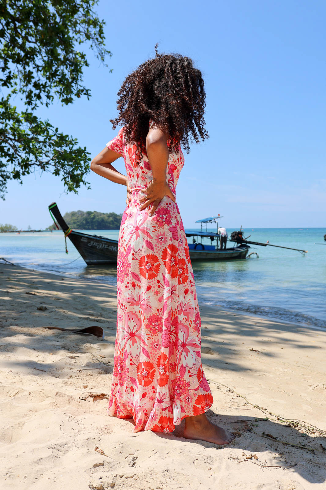
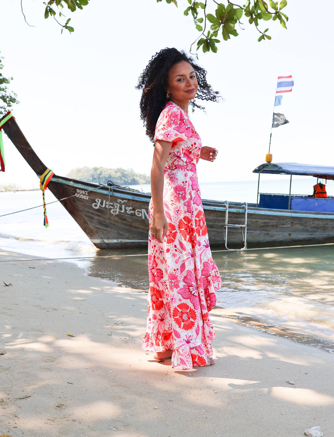
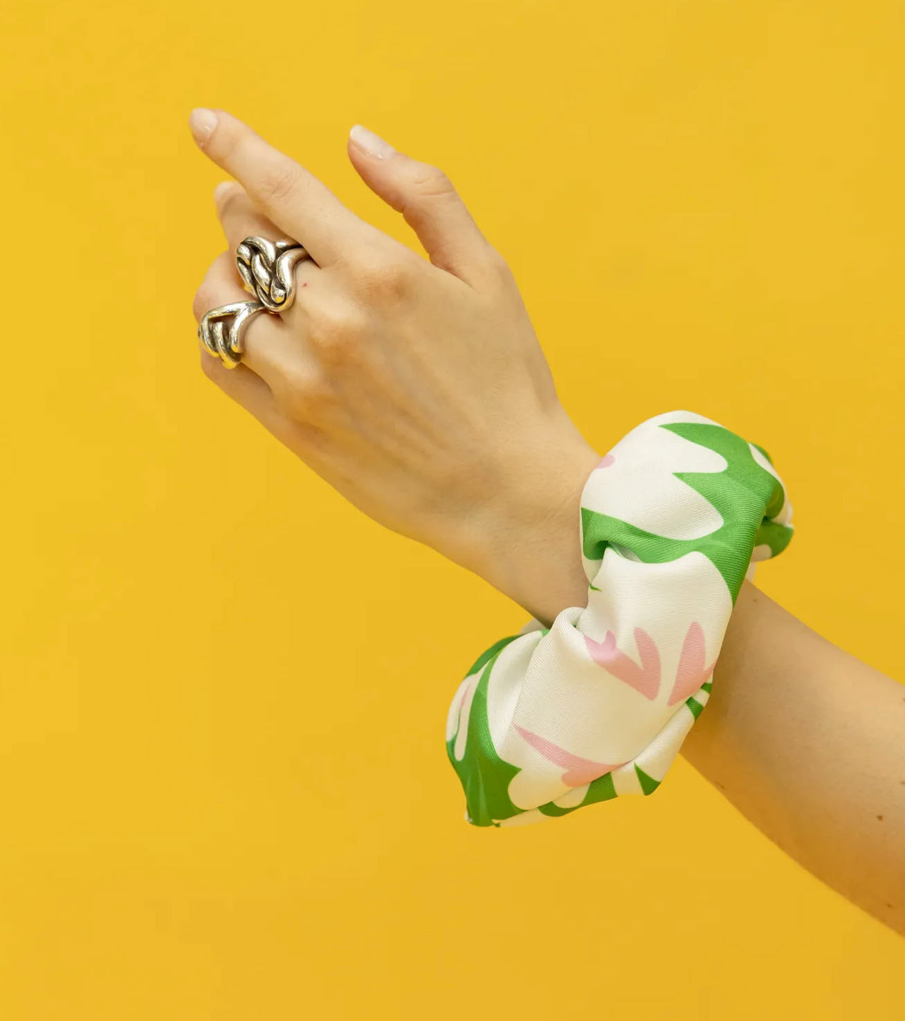
Joyful Pink Blooms Pattern For Laurella
Seeing my patterns on finished products is amazing. I remember creating this pattern inspired by summer flowers, and now seeing it on this stunning dress by Laurella is amazing.

Work Process
While working on the elements of this pattern, I studied local plants and created sketches, focusing on how to unify the diverse flowers within a single cohesive style. A key decision was choosing a monochromatic palette of pink and red shades. This approach ensured that no single flower stood out, allowing the pattern to maintain a harmonious and balanced composition.
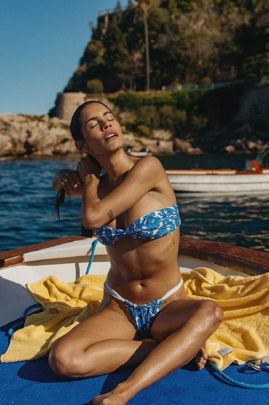
Blue Iris Pattern For Bright Swimwear
This pattern was inspired by the timeless elegance of the iris flower. The vibrant blue hues symbolize creativity and calmness, while the intricate lines and shapes capture the delicate nature of the blossoms. The simplicity of the color palette enhances the overall aesthetic, making it versatile for various applications.

Work Process
My goal was to create a seamless pattern that resembled a texture, evenly filling the surface without overpowering it. Upon closer inspection, the design reveals itself as a thoughtful composition of patterns. I aimed for the items adorned with this pattern to take center stage, with the pattern subtly enhancing their silhouette and bringing them to life.
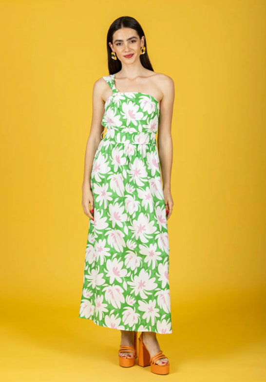
Peony Pattern For Chaton SS’24 collection
I remember the moment when the idea for this pattern came to me.
I wanted to create something simple yet expressive. My main inspiration was green—I adore this color—and pink as an accent.
I aimed to capture the feeling of buying a bouquet of peonies in early June. I worked on the silhouettes, striving to make them feel alive. Balancing simplicity with vibrant, interesting, lively, and playful shapes was essential.
______________________________
How to Work with Me
1. Inquiry & Discussion – Reach out with your project details, including preferred style, theme, and usage of the pattern.
2. Proposal & Agreement – I’ll provide pricing, timelines, and licensing options to ensure we’re aligned.
3. Design Process – I begin by researching the theme, and gaining a deep understanding of your brand and preferences. Then, I create a mood board and initial sketches, gradually refining them into unique illustrations that bring your vision to life.
4. Finalization & Delivery – Once approved, you receive high-quality files ready for production.
Let’s create something unique together! Feel free to contact me to discuss your project and learn more about the details of our collaboration.
______________________________
FUNNY AND CUTE PATTERNS
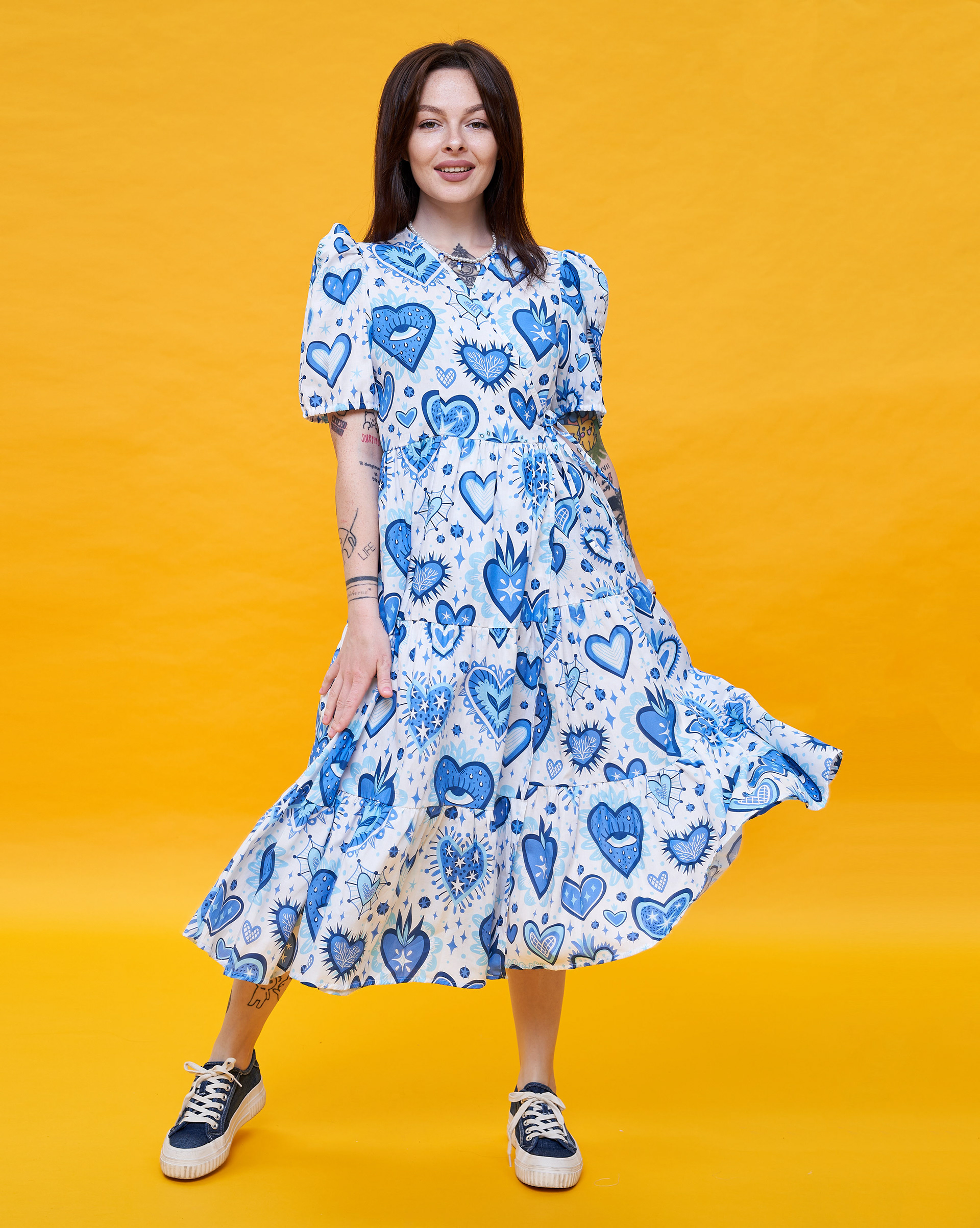
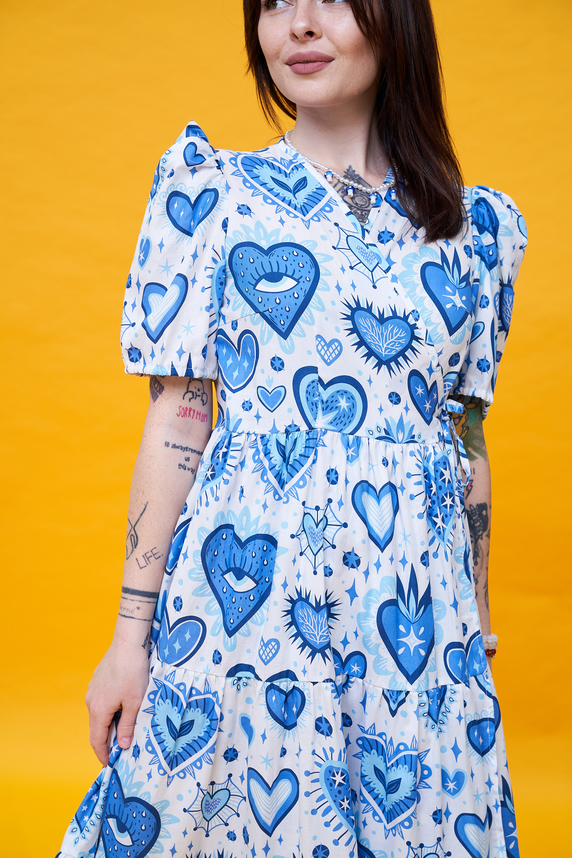
Sacred Heart Pattern Design For Love Vivienne
Thrilled to share my collaboration with the Love Vivienne fashion brand. It was a joy to create this design, and seeing it come to life on a dress and winter outfits is pure delight.

Work Process
Inspired by the sacred heart symbol, I aimed to capture its deep mystical significance while bringing a modern, vibrant, and playful twist to the design. My goal was to infuse the artwork with a fresh perspective on this age-old symbol. I sought to develop a fresh and distinctive color approach that deviates from the traditional red and dark tones typically associated with this theme. My goal was to create a unique visual identity while maintaining harmony and relevance within the design.
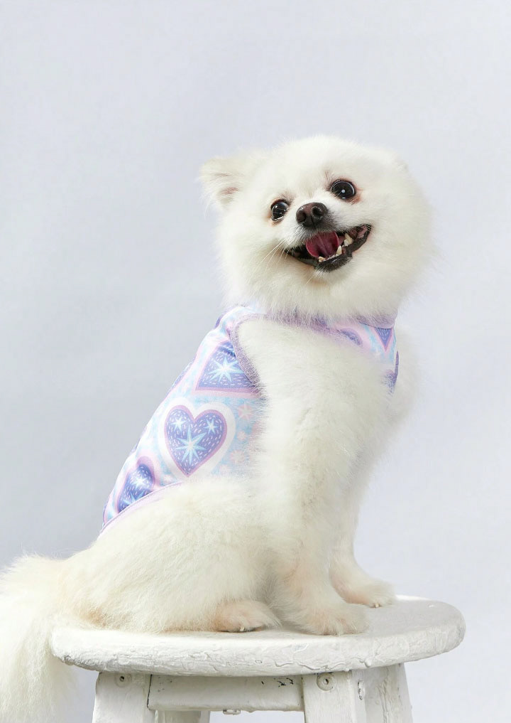
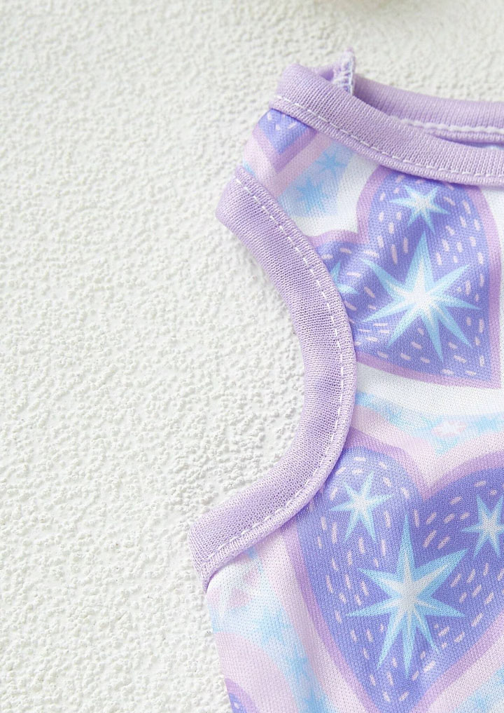
Pattern with hearts for pet top
The sweetest application of my pattern I've ever seen, designed for SheinX. These hearts and stars create simply enchanting charm.
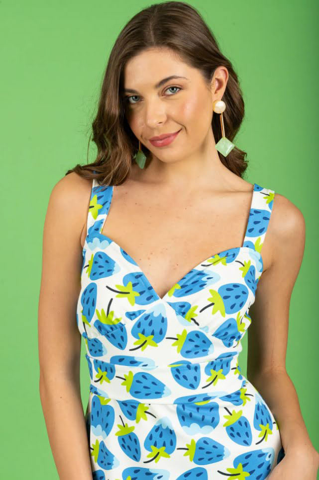
Strawberry Pattern For Chaton
Loving seeing my summery pattern with vibrant, juicy strawberries in the SS’24 collection by Chaton. Playful and charming, this summery pattern will complement both a suit and beautifully adorn a light dress.

Work Process
While working on this pattern, I aimed to create something vibrant and refreshing—something that captures the essence of peak summer. I wanted to use bold, recognizable symbols of the season while finding a new and original way to bring them to life. The result is a dynamic and expressive design that embodies the warmth, energy, and joy of summertime.
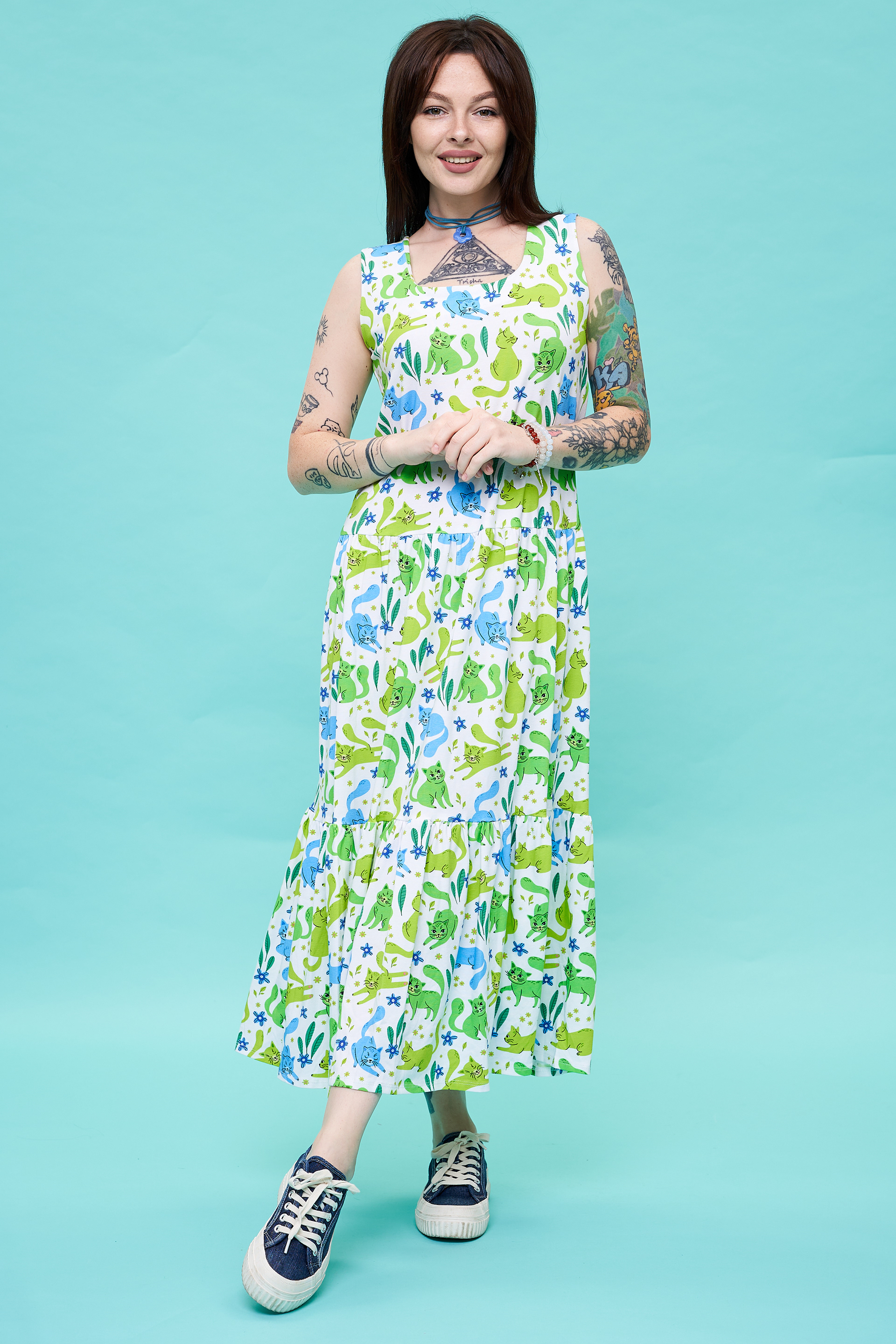
Pattern with CatsFor Love Vivienne
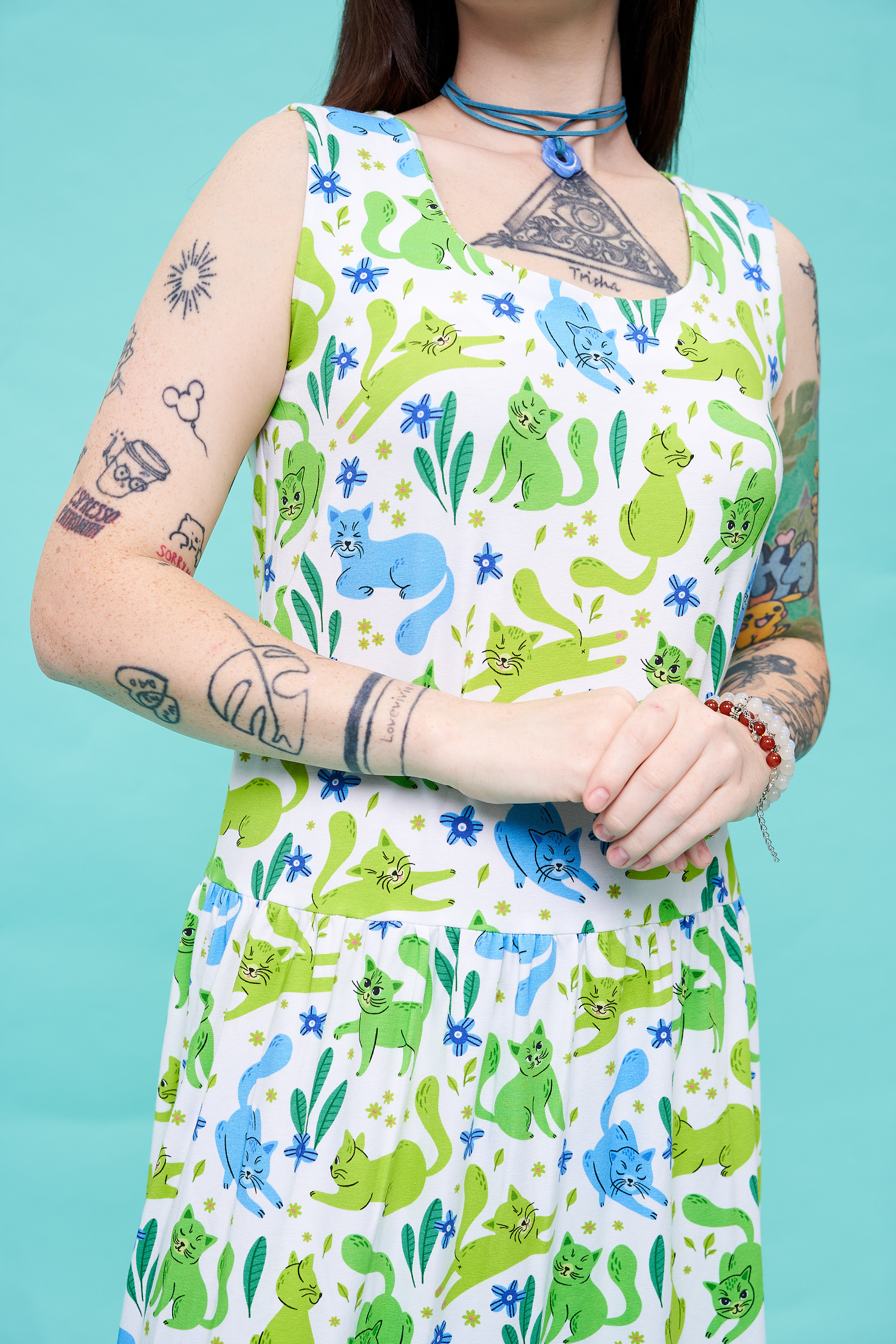
Summer, a new dress, kittens—it's the recipe for a great mood. And it's all easily achievable by getting yourself a new dress from the Love Vivienne fashion brand featuring my print. A fresh summer palette, great fit and fabric quality, and kittens!
It's the best plan ever!
My goal was to create a vibrant and appealing pattern featuring cute cats while avoiding excessive illustration detail or emotional emphasis. This approach ensured the pattern remained purely decorative and versatile for various applications.
______________________________
How to Choose Colors for Design
1. Client Preferences
I carefully consider the client’s wishes and incorporate their preferred color palette to ensure the pattern perfectly matches their vision.
2. Exploring Trends
I stay up-to-date with current design and fashion trends to ensure the colors in my patterns are modern and relevant.
3. Theme and Harmony
The colors I select always align with the theme of the
pattern and harmonize well with each other, creating
a cohesive and visually appealing design.​​​​​​​
4. Vector-Based Flexibility
I strive to create my patterns in vector format, which allows for easy color adjustments, scaling of the pattern, and modifications of individual elements. This ensures maximum flexibility and adaptability for different applications.
Let’s create something unique together! Feel free to contact me to discuss your project and learn more about the details of our collaboration.
______________________________
PACKAGING DESIGN
Watercolor Pattern And Lettering For EHRENWORT
I'm delighted to present this exquisite project that I had the privilege to collaborate on with my Austrian client.
I have a genuine passion for cooking and always strive to use locally sourced, high-quality ingredients, not to mention the importance of spices! This is why working on illustrations and lettering for EHRENWORT resonated deeply with me, as it aligns perfectly with my values. It was a captivating experience to collaborate with a brand that places such a strong emphasis on the quality of its products.
Needless to say, I had a blast bringing it to life.
Illustrations for Loli's Dressings
I particularly enjoyed working on this project as it was a collaborative effort. My role was to design illustrations that seamlessly integrated into the overall composition and complemented the chosen background. I put a lot of effort into selecting the right colors and refining the composition. The final result not only met the expectations of the art director and the client but also reflected a polished and professional outcome, making it a rewarding experience
Illustrations & Packaging Design for Organsia Tea
I had the pleasure of developing the complete packaging style for Organsia’s new line of organic teas. My role included designing illustrated packaging for the entire series, as well as crafting the overall aesthetic and all visual elements.
I focused on creating vibrant, nature-inspired illustrations that reflect the organic essence of the brand while ensuring each flavor is visually distinctive yet cohesive within the collection. From choosing the right color palettes to refining intricate botanical compositions, every detail was carefully considered to enhance the brand’s natural and premium appeal.
Working with Organsia was an incredibly rewarding experience, as I deeply appreciate their commitment to organic products and sustainable packaging. I'm excited to see these designs come to life and resonate with tea lovers worldwide!
Watercolor Magnolias Pattern
I have crafted this collection inspired by the enchanting blossoming of magnolias, which always evokes the spirit of spring in my mind—when nature awakens and everything is painted with vibrant hues. These elements exude charm and perfectly complement Albi products.
Work Process
In this pattern, I aimed to capture the elegance of magnolias, using watercolor for soft color transitions. I chose a harmonious pink and lilac palette against a dark background to enhance their beauty. To make the design more dynamic, I depicted magnolias at different stages of bloom and from various angles. The goal was to create a balanced, airy composition where each element flows naturally within the pattern.
Let’s Create Together!
Back to Top