
PACKAGING DESIGN
Packaging design is a complex and precise process. Every detail matters — from layout logic and typography to the structure of information that must be clear, readable, and visually balanced. A single package often carries a large amount of content, and the challenge is to present it in a way that feels effortless for the customer.
But the most important part is attraction. Sometimes just a fraction of a second decides the fate of a product — whether people notice it, stop, and choose it, or simply walk past.
With over 50 packaging designs created, I understand how to combine aesthetics, clarity, and commercial appeal. I’ll be happy to help you make your product the one customers reach for first.
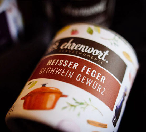
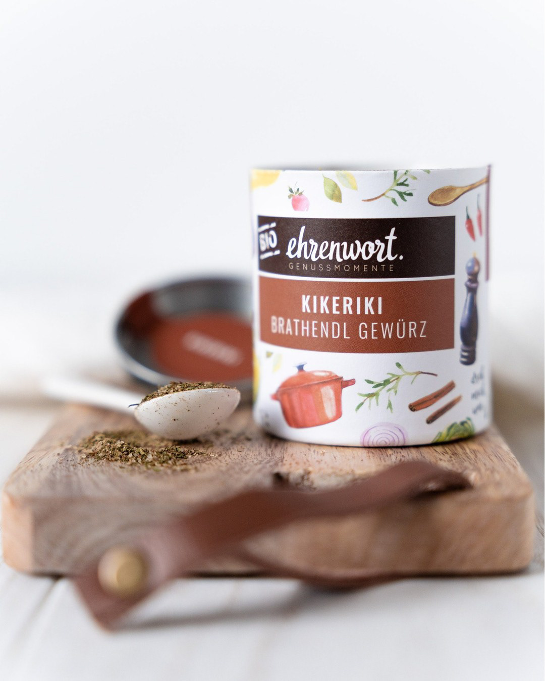
Watercolor Pattern And Lettering For EHRENWORT
I'm delighted to present this exquisite project that I had the privilege to collaborate on with my Austrian client.
I have a genuine passion for cooking and always strive to use locally sourced, high-quality ingredients, not to mention the importance of spices! This is why working on illustrations and lettering for EHRENWORT resonated deeply with me, as it aligns perfectly with my values. It was a captivating experience to collaborate with a brand that places such a strong emphasis on the quality of its products.
Needless to say, I had a blast bringing it to life.
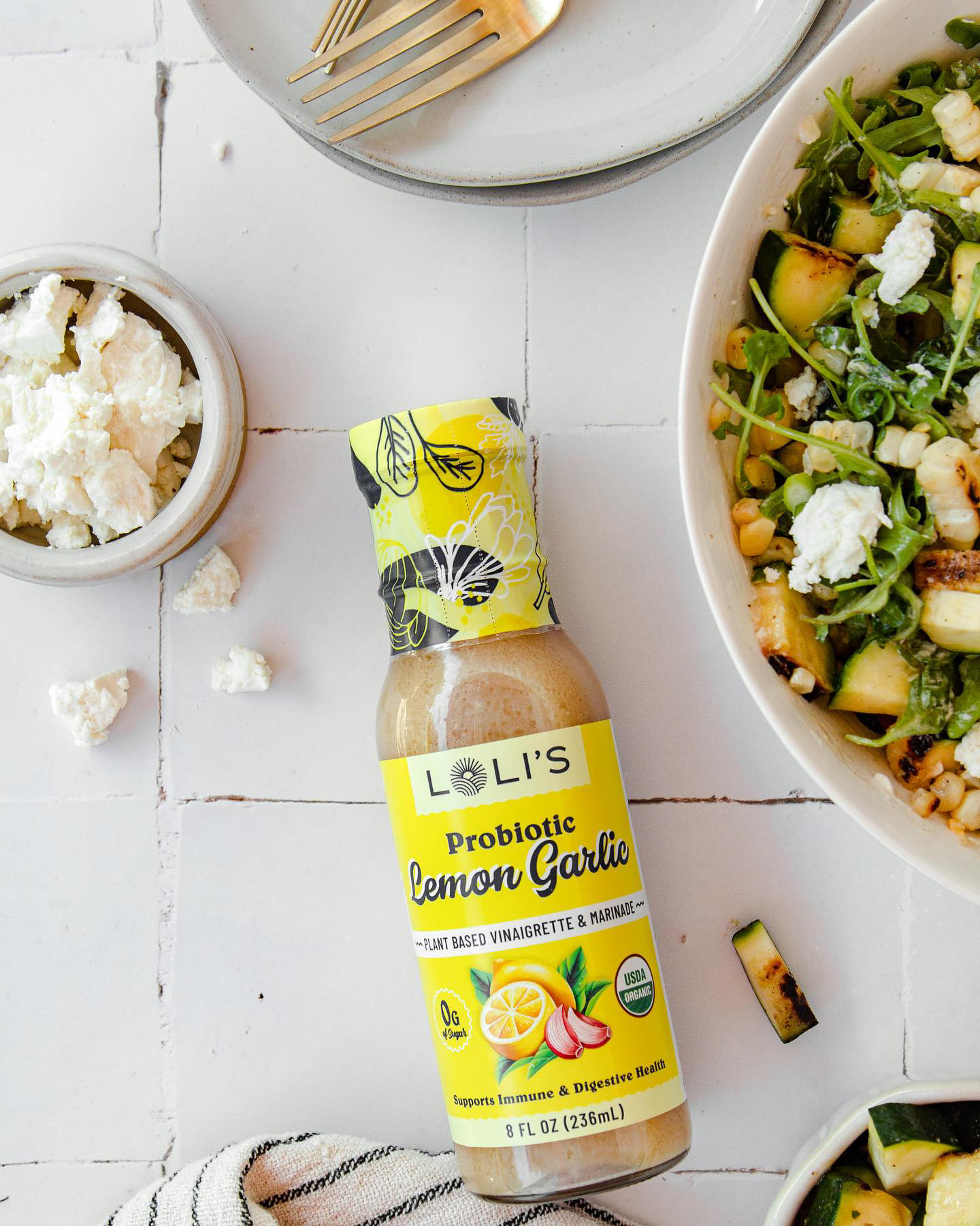
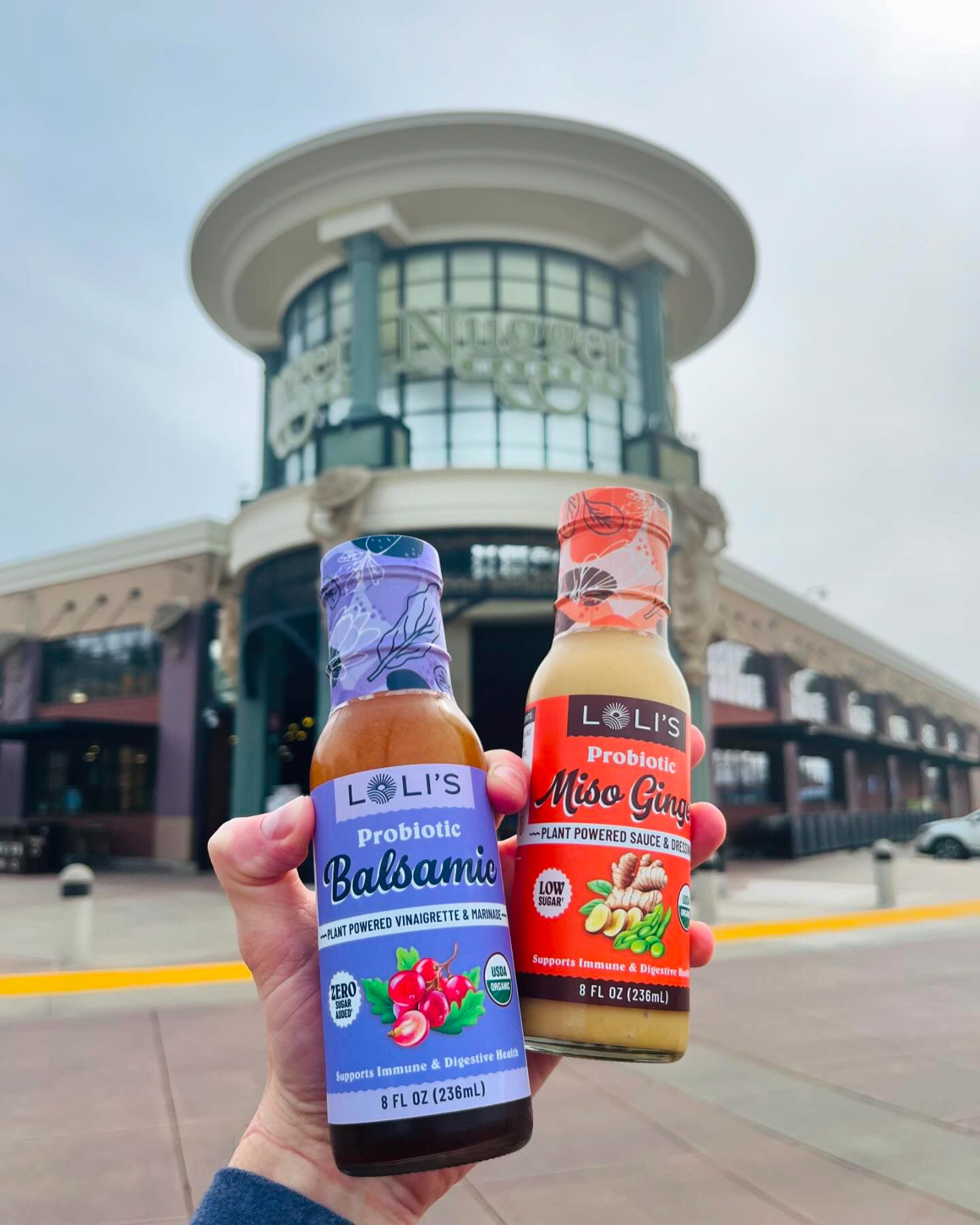
Illustrations for Loli's Dressings
I particularly enjoyed working on this project as it was a collaborative effort. My role was to design illustrations that seamlessly integrated into the overall composition and complemented the chosen background. I put a lot of effort into selecting the right colors and refining the composition. The final result not only met the expectations of the art director and the client but also reflected a polished and professional outcome, making it a rewarding experience
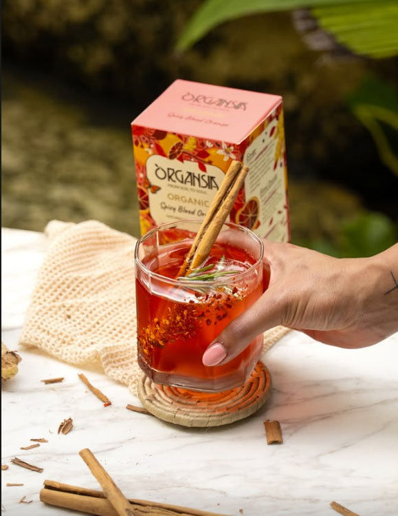
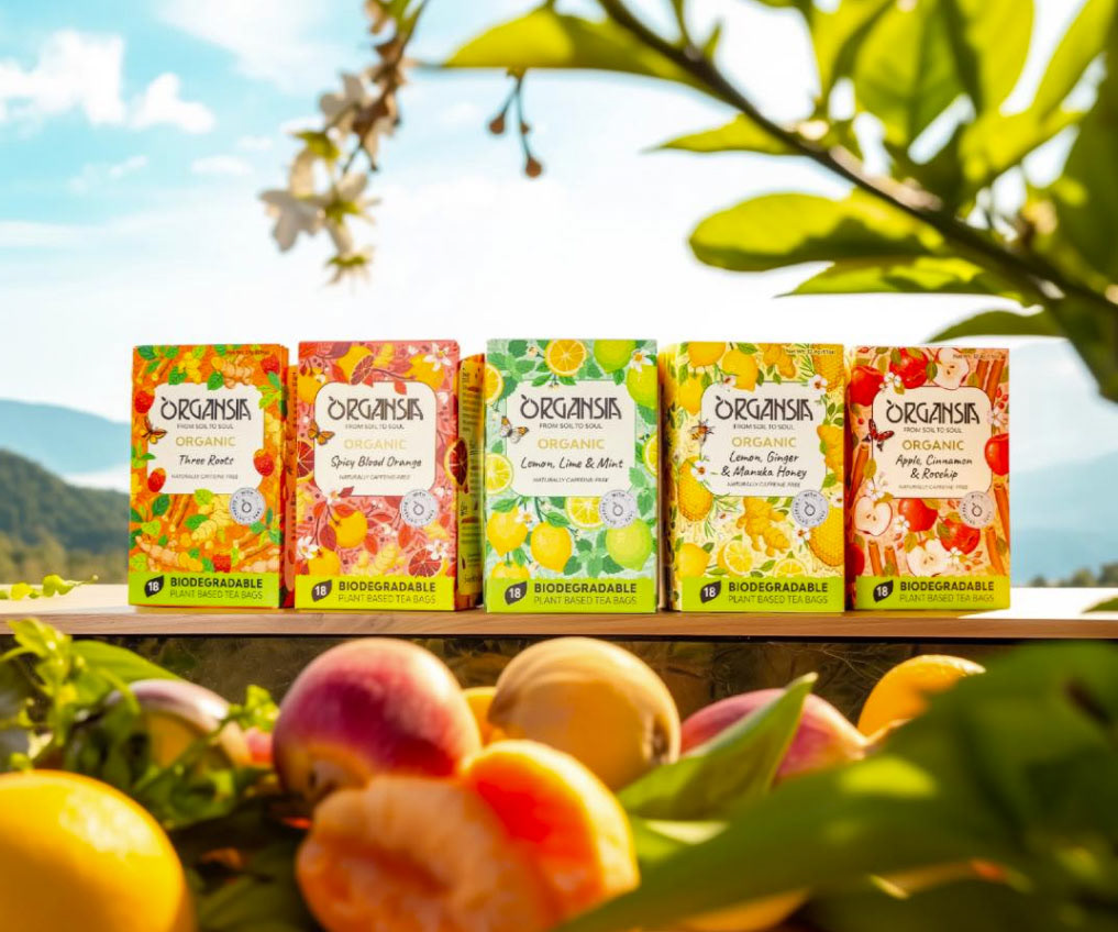
Illustrations & Packaging Design for Organsia Tea
I had the pleasure of developing the complete packaging style for Organsia’s new line of organic teas. My role included designing illustrated packaging for the entire series, as well as crafting the overall aesthetic and all visual elements.
I focused on creating vibrant, nature-inspired illustrations that reflect the organic essence of the brand while ensuring each flavor is visually distinctive yet cohesive within the collection. From choosing the right color palettes to refining intricate botanical compositions, every detail was carefully considered to enhance the brand’s natural and premium appeal.
Working with Organsia was an incredibly rewarding experience, as I deeply appreciate their commitment to organic products and sustainable packaging. I'm excited to see these designs come to life and resonate with tea lovers worldwide!
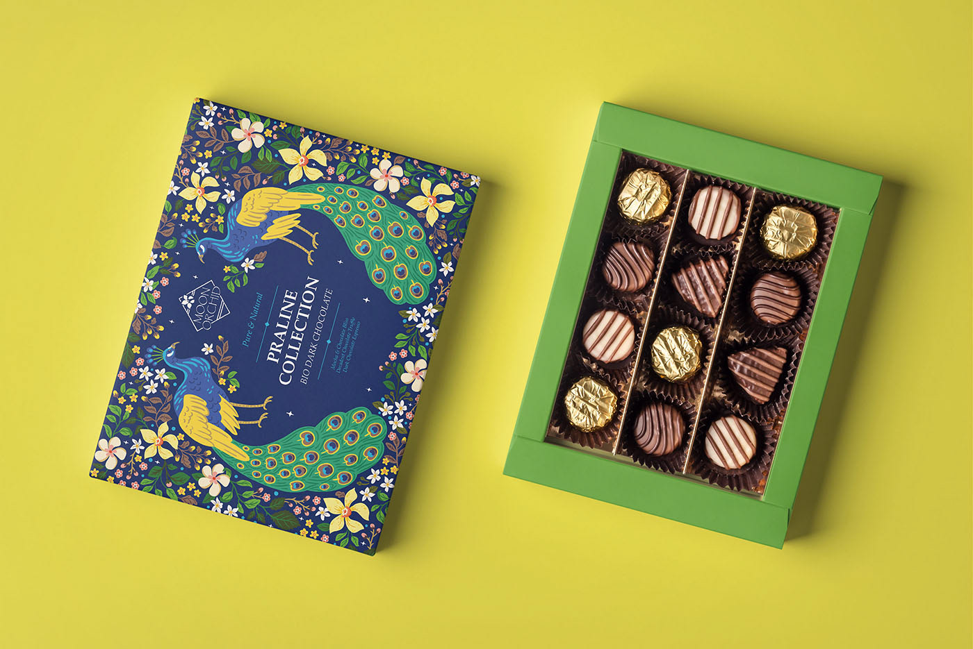
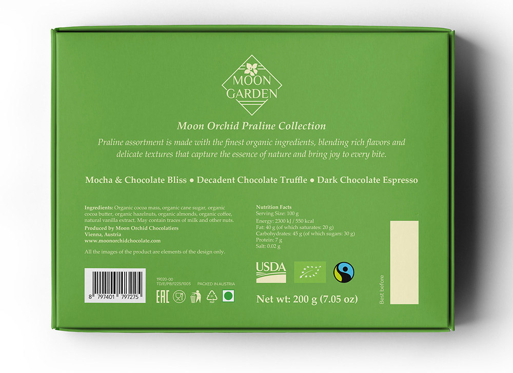
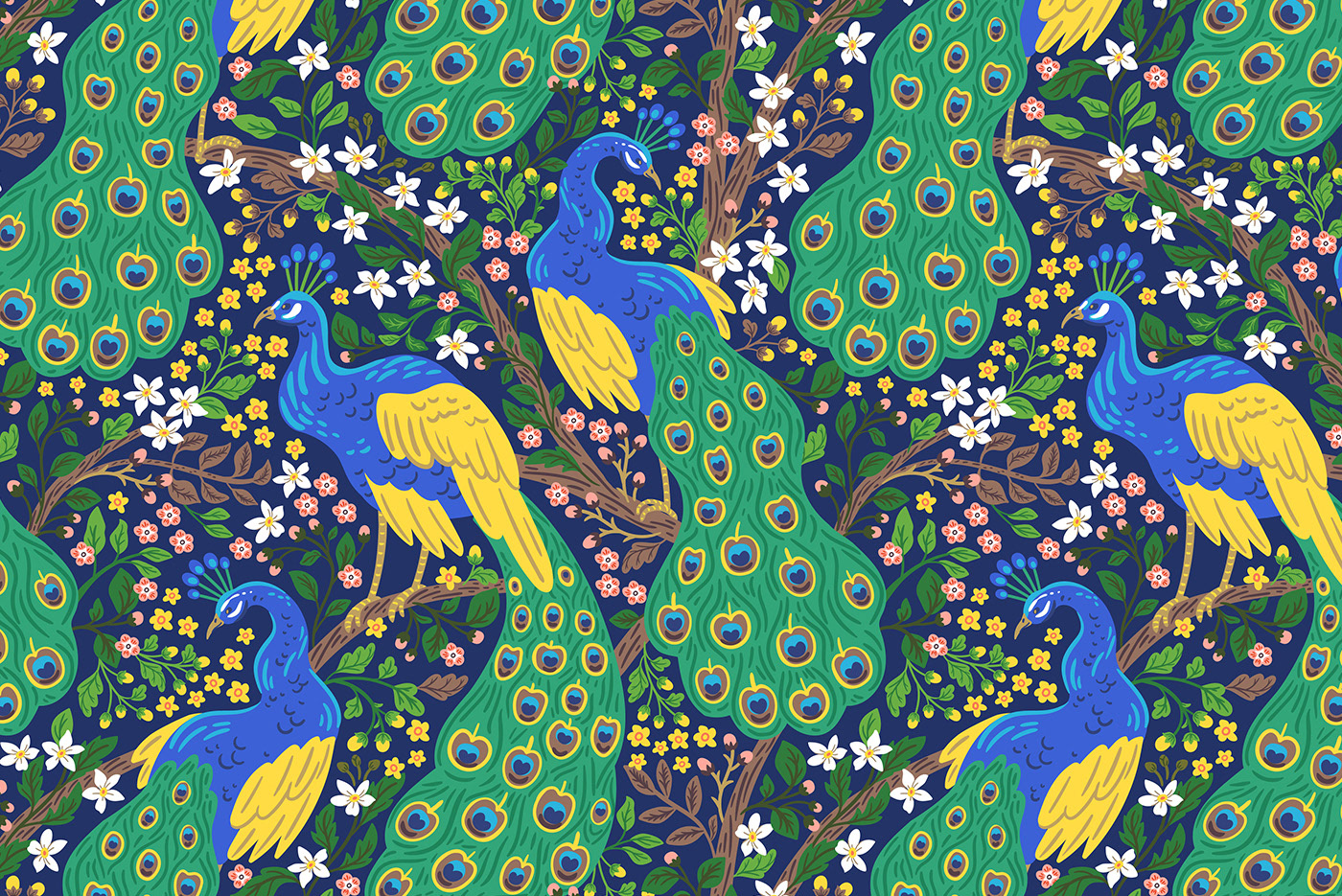
Moon Garden – Chocolate Pralines Packaging Design
I created the packaging design for the Moon Garden Praline Collection, drawing inspiration from the elegance of nature and the refined charm of traditional craftsmanship. The design features rich botanical illustrations and vibrant peacock motifs that evoke luxury, indulgence, and a sense of enchanting mystique — perfectly complementing the premium organic dark chocolate inside.
The visual style blends ornamental details with lively, hand-drawn elements. The two peacocks, surrounded by lush florals and foliage, serve as central symbols of beauty and harmony. Their intricate feathers, combined with dynamic floral accents, create a design that feels both sophisticated and expressive.
To elevate the premium feel, I developed a deep, atmospheric color palette inspired by exotic gardens — a combination of soft greens, golden tones, and dark blues. This palette adds depth and refinement while keeping the artwork vibrant and approachable. The result is a packaging design that feels ornamental, storytelling-driven, and unmistakably luxurious.
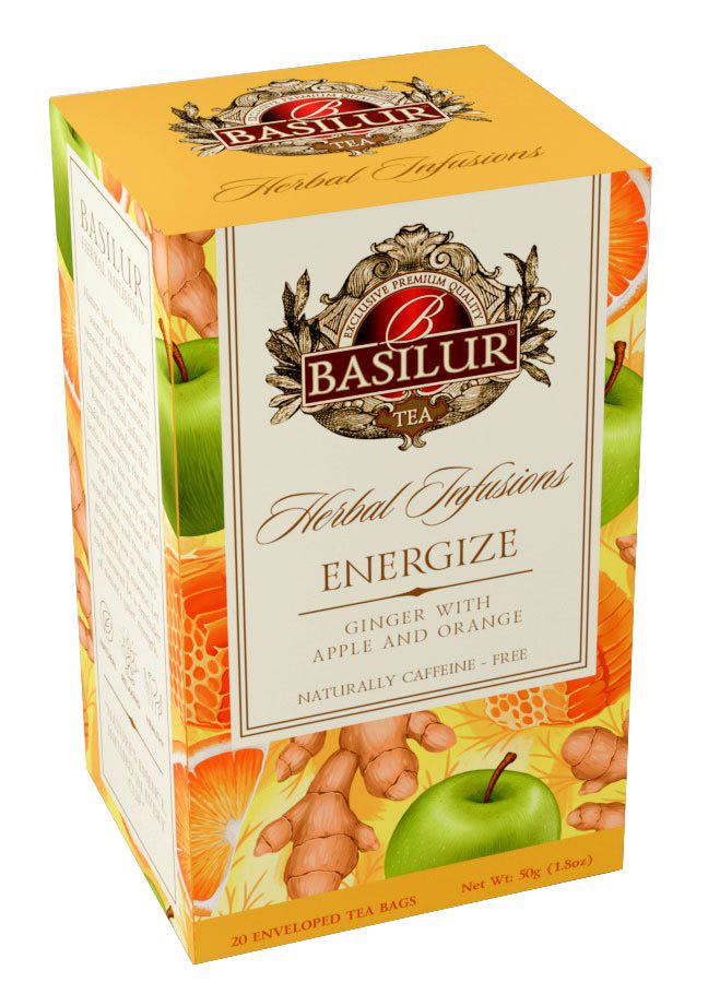
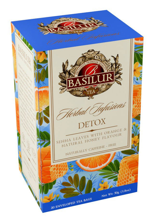
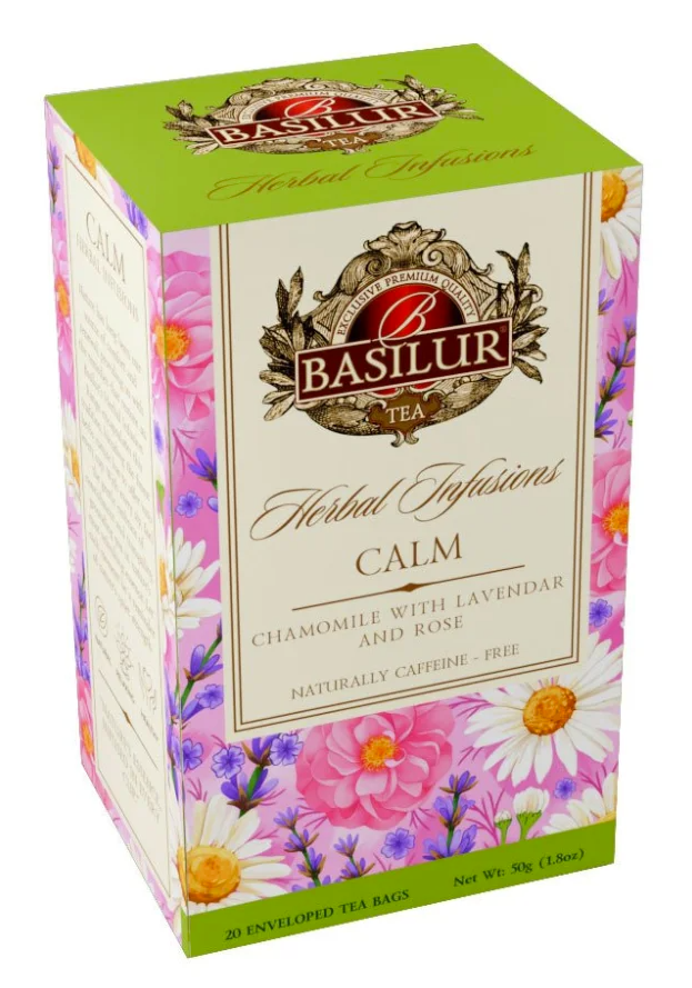
Packaging Redesign for Basilur Tea
I worked on the packaging redesign for Basilur — a renowned tea brand with a long-standing heritage. The goal was to refresh the visuals while preserving the brand’s classic identity.
I created new botanical illustrations and refined the compositions to give each blend a distinctive look, yet keep the collection cohesive. Brighter palettes, modernized details, and ingredient-focused imagery helped bring a fresh energy to the traditional style.
This project required balancing respect for Basilur’s legacy with a cleaner, more contemporary approach. I’m proud of how the updated designs feel both renewed and true to the brand.
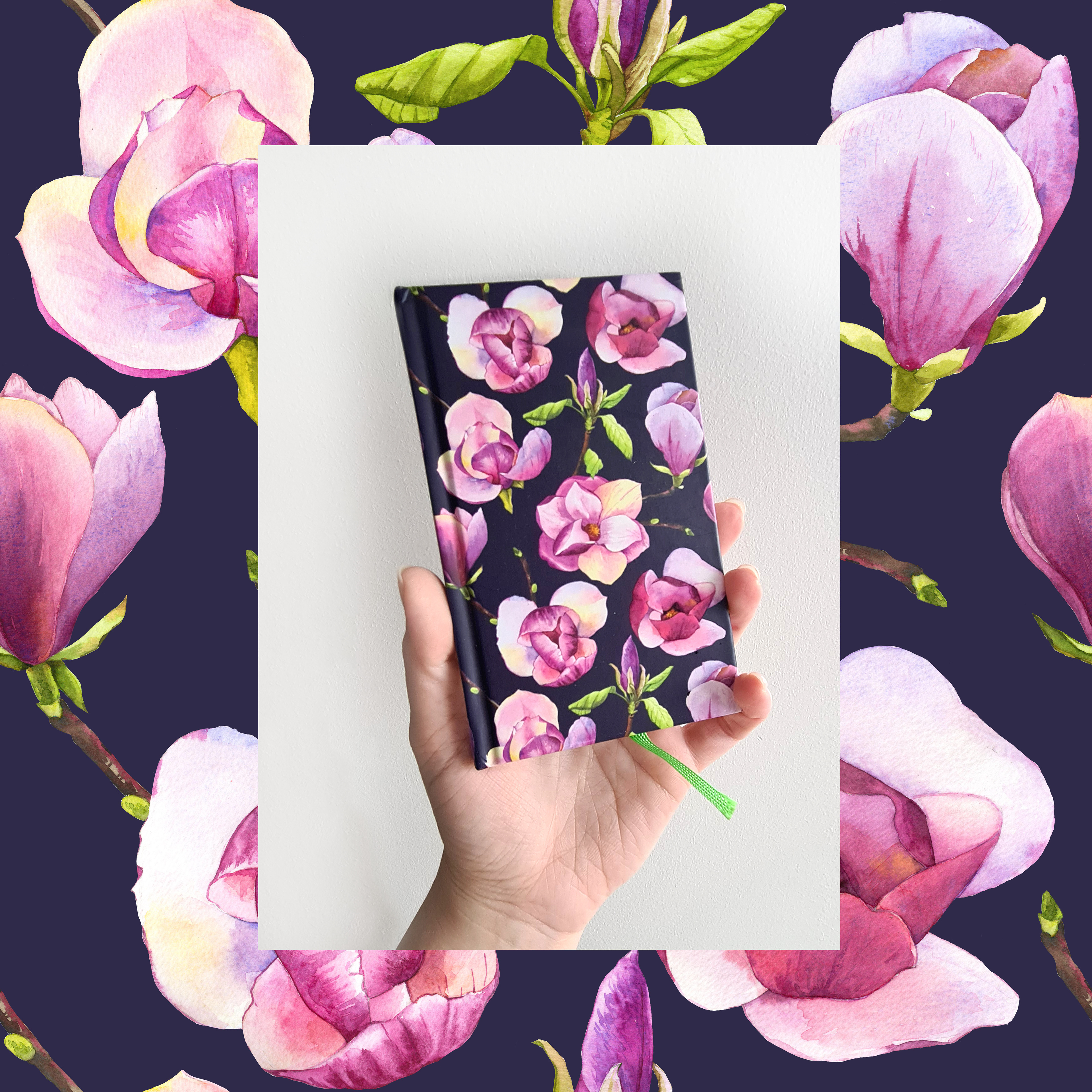
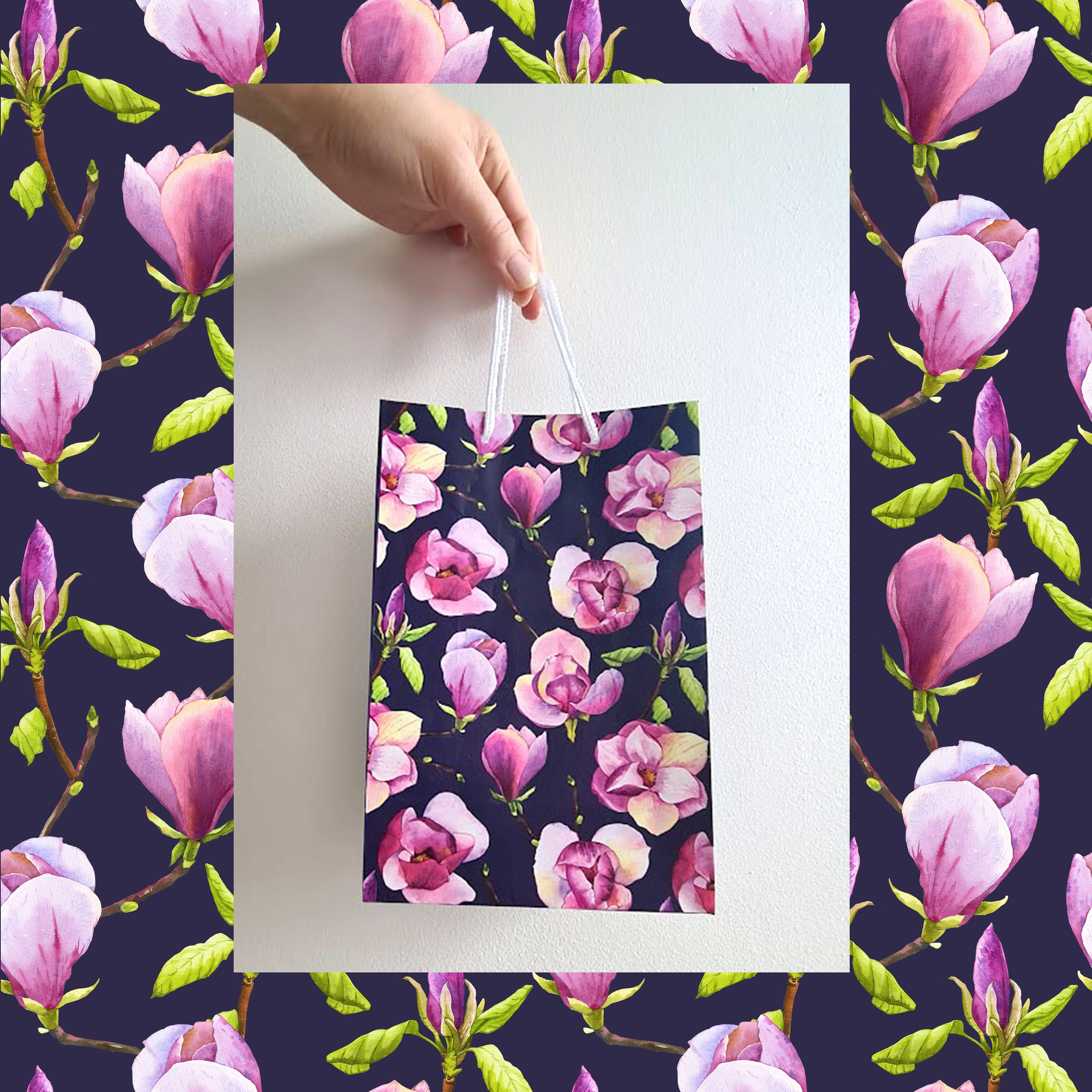
Watercolor Magnolias Pattern
I have crafted this collection inspired by the enchanting blossoming of magnolias, which always evokes the spirit of spring in my mind—when nature awakens and everything is painted with vibrant hues. These elements exude charm and perfectly complement Albi products.
Work Process
In this pattern, I aimed to capture the elegance of magnolias, using watercolor for soft color transitions. I chose a harmonious pink and lilac palette against a dark background to enhance their beauty. To make the design more dynamic, I depicted magnolias at different stages of bloom and from various angles. The goal was to create a balanced, airy composition where each element flows naturally within the pattern.
Let’s Create Together!